
The Power of Color in Interior Design: Transforming Spaces and Emotions 🎨✨
Share
Color is a fundamental element of interior design, capable of shaping the way we perceive and feel about our surroundings. From influencing emotions to enhancing functionality, the strategic use of color can turn any space into a cohesive, visually appealing, and purposeful environment. Below, we’ll dive deeper into five key reasons why color is essential in interior design and how to make the most of it.
Setting the Mood: The Psychology of Color 🧠🌈
Colors profoundly affect our emotions, influencing how we feel in a given space. Each color has psychological associations, and designers use these to set the tone for different rooms.
- Warm Colors (Reds, Oranges, Yellows): These colors are vibrant and energizing, often associated with happiness, warmth, and activity. A red wall in a dining room can stimulate conversation and appetite, while orange accents in a living room can evoke enthusiasm and creativity.
- Cool Colors (Blues, Greens, Purples): These shades are calming and serene, promoting relaxation and focus. A bedroom painted in soft blue creates a tranquil atmosphere ideal for rest, while green is perfect for spaces that need a touch of nature’s calmness, like a home office or study.
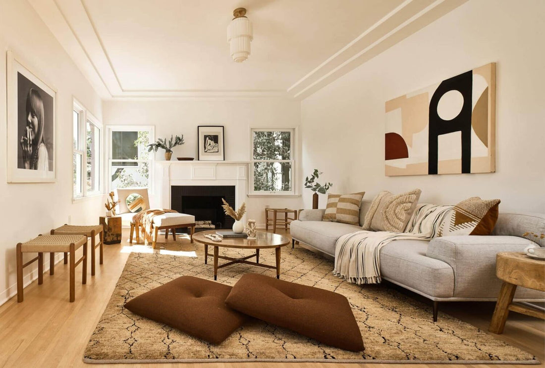
- Neutral Colors (Whites, Grays, Beiges): Neutral tones act as a canvas for other elements, promoting balance and timelessness. A gray living room with white trim can exude sophistication, while beige offers a warm and inviting feel.
By understanding how colors affect emotions, designers can craft spaces that align with their purpose, ensuring every room evokes the desired response.
Defining Spaces with Color 🎯📏
In modern homes, open-concept layouts and multi-purpose rooms are increasingly common, and color becomes a powerful tool for visually defining spaces without physical dividers.
- Zoning: Colors can create visual boundaries in an open floor plan. For instance, a kitchen area might feature a bold accent wall in navy blue, while the adjacent dining space uses a lighter, complementary shade like pale gray.
- Accent Pieces: Rugs, curtains, or cushions in specific colors can anchor distinct zones. For example, a yellow area rug can signify a reading nook, while a teal sofa defines the living space.
- Consistency with Variety: To maintain cohesion, designers often repeat elements of a color palette across the space, ensuring that transitions between areas feel seamless.
Color zoning not only improves functionality but also makes a space more dynamic and aesthetically pleasing.
Enhancing Natural Light and Space Perception 🌞🪟
Color plays a vital role in how we perceive a room’s size and lighting. Strategic color choices can make spaces feel more expansive or intimate.
- Light Colors: Soft shades like white, cream, and pastel tones reflect light, making small spaces feel larger and brighter. For example, a compact studio apartment painted in pale lavender can feel airy and open.
- Dark Colors: Rich tones like charcoal, deep green, or burgundy absorb light, creating a sense of coziness and depth. A large living room with high ceilings can feel more grounded and inviting when painted in a darker shade.
- Ceiling Tricks: Painting the ceiling a lighter color than the walls can make it feel higher, while darker ceilings can add drama and intimacy.
Combining these techniques with thoughtful lighting ensures a space not only looks beautiful but also feels right for its intended purpose.
Expressing Personality and Style ✨🖌️
Color is a direct reflection of individual tastes, making it an essential tool for personalizing a home or office space.
- Bold Choices for Adventurers: Vibrant hues like emerald green, fuchsia, or cobalt blue showcase confidence and creativity. These colors work well as statement walls, furniture pieces, or decor items.
- Serene Choices for Minimalists: Soft neutrals, whites, and earthy tones create a tranquil, understated elegance that suits those who prefer simplicity.
- Eclectic Combinations: Mixing unexpected colors, like mustard yellow with navy or pink with olive green, can create an energetic and playful vibe.
Interior designers often collaborate with clients to understand their preferences and curate palettes that resonate with their personalities, ensuring the space feels truly theirs.
Creating Harmony Through Color Theory 🎨⚖️
Color theory is the backbone of creating visually pleasing and balanced interiors. A deep understanding of how colors interact helps designers craft harmonious spaces.
- Complementary Colors: These are opposite on the color wheel, such as blue and orange or red and green. When used together, they create a high-contrast and dynamic look, perfect for vibrant, energetic spaces.
- Analogous Colors: These are next to each other on the color wheel, such as yellow, yellow-green, and green. They offer subtle, harmonious transitions, ideal for serene and cohesive designs.
- Monochromatic Schemes: These use different shades, tints, and tones of a single color, creating depth and sophistication. For instance, a room decorated with varying shades of blue—from pale sky to deep navy—can feel both cohesive and rich.
By applying these principles, designers ensure that a space’s color palette feels intentional, balanced, and aesthetically satisfying.
The Heartbeat of Design
Color is an indispensable element of interior design, capable of transforming spaces, evoking emotions, and enhancing functionality. Whether it’s through creating a mood, defining areas, or personalizing a space, color has the power to turn ordinary interiors into extraordinary experiences.
When designing or revamping your space, don’t just focus on what looks good—think about how the colors make you feel and what they convey about your style. Remember, a thoughtful palette doesn’t just beautify; it inspires. 🌈✨